
Using component properties, you can add many layers of information about a component in your design system, such as statuses, links to documentation and other sources, links to components in Figma, boolean values or notes. These properties can be used to track information about your compoents and they can also be used in Supernova documentation.
In the components view, each column represents a component property.

Properties require the following details:
- Name: Name of the property.
- Description: Description of what the property is for (this will also be used to explain a property where it is used in other places, such as a documentation block).
- Code name: The code-friendly version of the property name, and the name to be used in code generation.
- Type: The type of property (see below).
Types of properties
The types of properties that can be added:
|
Text |
Editable text |
|---|---|
|
Number |
An editable number |
|
Boolean |
A true or false value, displayed in the list as a toggle |
|
Select |
A select input, with options that can be changed |
|
Code |
Displayed as code |
|
URL |
An external link |
|
Documentation link |
A link to a documentation page in Supernova |
|
Figma component |
A connection to a Figma component that has been imported to Supernova |
Create a new property
- To create a new property, click the + button at the end of the properties row.
- In the dialog, fill in the information and select a type.
- Click Confirm to create the property.

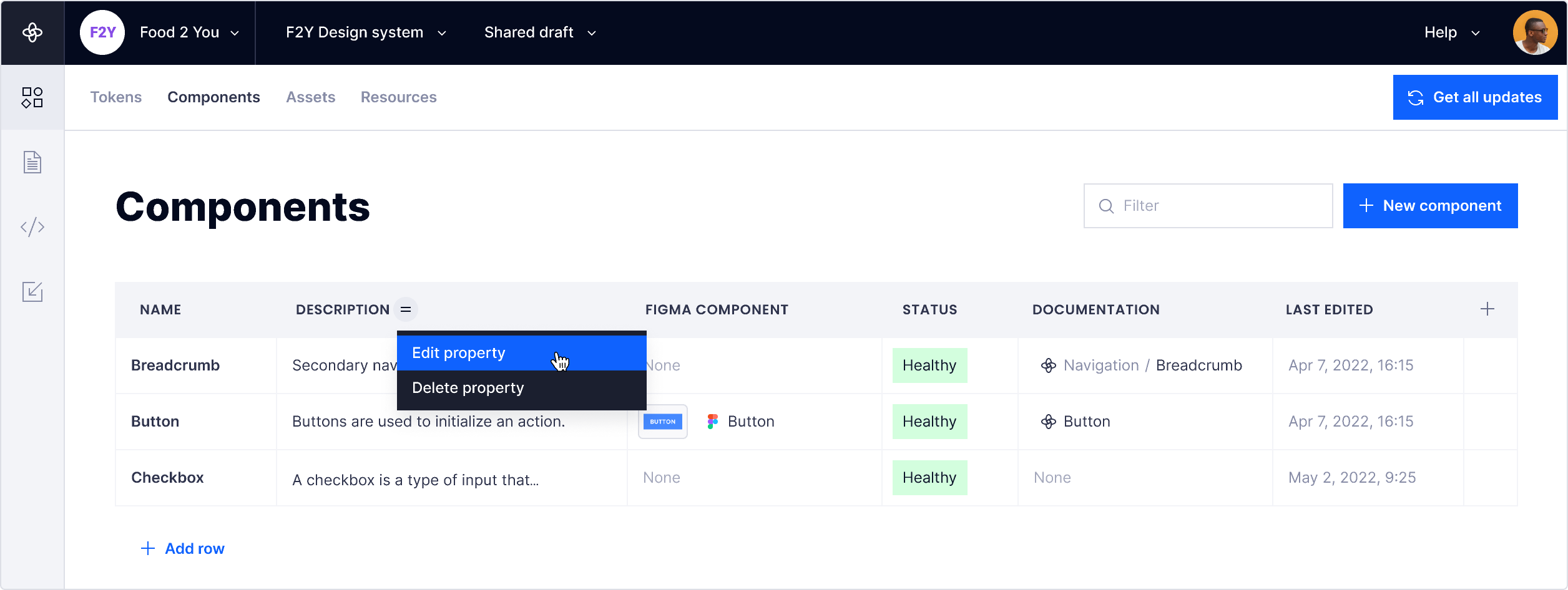
Edit a property
- To edit a property, hover over the property column header and click the = menu icon
- Select Edit property.
- In the dialog, make the changes and click Confirm.
Edit and remove select property options
A select property type requires one or more options. When creating the property, you will have the opportunity to add options in the dialog. Select options can be edited or removed at any time.
Edit option color
You can also add a colour label for the option that will be displayed in the component list.
- In the edit property dialog, click the color preview to select a new color.
- Click the Reset icon to reset the color to default.
Remove options
If an option is removed it will be removed from all components that contain that value.
- In the edit property dialog, click the x icon to remove the option.

Add or edit a property value
To edit a property value for a component, edit the value for the input on the component row.
Different property types have different methods of editing. A text property can be edited in place, a boolean value is a toggle that can be changed.

Delete a property
- To delete a property, hover over the property column header and click the = menu icon.
- Select Delete property and Confirm in the delete dialog.
- Alternatively, you can click the Delete button in the edit property dialog.
