All color themes
Works properly across all four color themes (lightest, light, dark, darkest).
When published, the component checklist block looks like this:
All color themes
Works properly across all four color themes (lightest, light, dark, darkest).
Is documented
The component is fully documented by our standards.
Accessible use of color
Color is not used as the only visual means of conveying information (WCAG 2.0 1.4.1).
In UI library
Is included in our Figma library UI library.
Figma component
Includes a link to a Figma component that has been imported to Supernova
Status
The component has a health status indicated
Documentation link
There is a connected documentation page in Supernova
Repository
Includes a link to an external code repository
The component checklist block displays a table showing a selected component, and highlighting selected properties of the component.
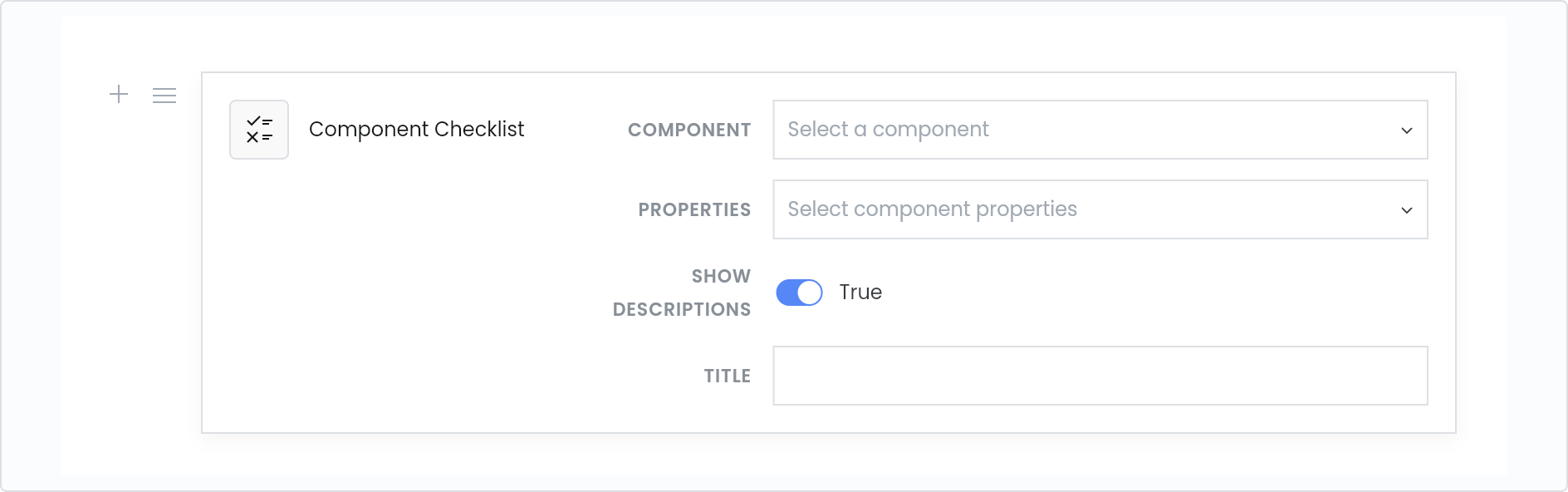
The component checklist block as it appears in the documentation editor