
Component blocks can be used in your documentation to display Supernova components in your design system, and different properties attached to them.
You can create components directly in Supernova, and link them to components in your Figma data source - to learn more about creating components, read Working with components.
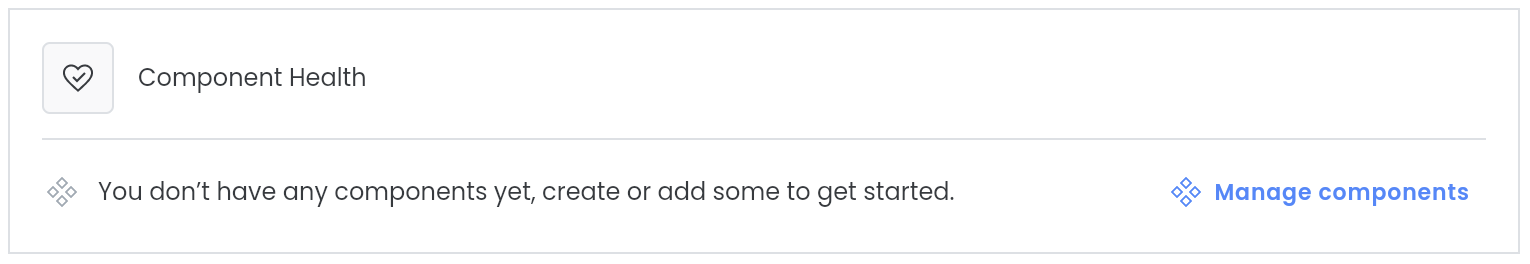
If you haven't added any components to your design system yet, we'll let you know in the token block (if you have an Editor or Admin role), and you can head to the Components section to add or create some.
There are three component blocks to choose from: component health, component checklist, and component overview table.
In each component block you can choose from the following default properties to display:
- Figma component — A link to the component in the Figma data source
- Status — The health status of the component
- Documented — An indication of whether the component is documented or not
- Documentation link — A link to the documentation for the component
- Repository — A link to the repository containing the component
- Custom - Any custom property you have created